Author Fillable Field or Fillable Checkbox
Fillable Fields or Fillable Checkboxes may be authored to reserve space on an assembled PDF to capture data input. These element details are output to the assembly-log.txt file saved to the application data folder each time a transaction is assembled (c:\Users\user.name\AppData\Local\Temp\) as well as included in the Expere API services.
When a Fillable Checkbox element is encountered in content, logic is used during processing to reserve the appropriate space for formatting and a post-processing operation adds an AcroForm checkbox object at the position indicated. The checkbox is an Adobe object sized as .1in by .1in plus a following space. The FieldName element value authored is used as the AcroForm object name.
A Fillable Field is be placed so that text entered in the field reads consistently with preceding and following text, such that the baseline of text entered in the field must be the same as the baseline of other text on the same line. This placement is independent of the height property associated with the field. AcroForm field values are vertically aligned in the middle of the field rectangle and this alignment cannot be modified programmatically; therefore, the placement of the field rectangle is computed from the desired baseline, taking into account the height of the field, the height of the font for field data.
Fillable Checkbox and Fillable Fields are tagged for accessibility when producing a TaggedPDF. See Accessibility in Tagged PDF Implementation Guide for further details.
The FillableField element is available only as a child to the FragmentedPara and FragmentedPhrase elements.
The FillableCheckbox element may be authored as a child of the following elements; however, the most common use is FragmentedPara.
- Tagline
- HorizontalListItem
- FragmentedPhrase
- FragmentedPara
- LinkText
FillableField/FillableCheckbox may be authored in a HeaderNotice. However, the functionality to create the Acroform text field/object accurately on the PDF is not supported as this time.
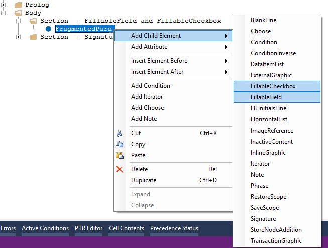
To add elements or attributes, right-click the FillableField or FillableCheckbox element and select Add Child Element or Add Attribute from the shortcut menu.
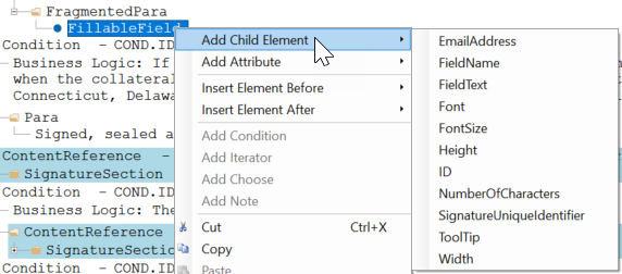
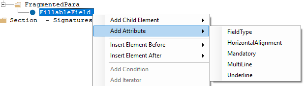
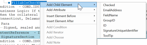
The table below outlines the attributes and elements available and authoring rules for the FillableField and FillableCheckbox elements. Items with an asterisk (*) are added automatically when the FillableField/FillableCheckbox is inserted.
| FillableField Element | Required/Optional | Description |
| EmailAddress* | Optional | Indicates the inclusion of a recipient's Email Address. Attention: This
is required for WKES use. |
| FieldName* | Required | The name of the fillable field. The contents may be a string, a Data element (DTA)
with a PTR authored, or a mix of text and Data elements. The FieldName must conform to the
rules for an AcroForm field. Note: Adobe Acrobat has special rules for handling fields when the
field name contains a period or space. Do not use spaces or periods when authoring
FieldName. Special characters may be used; however, use of the ampersand (&) will
result in assembly error.
|
| FieldText* | Optional | The prepopulated text for the field. The contents may be a string, a Data element (DTA) with a PTR authored, or a mix of text and Data elements. Special characters may be used, however use of the ampersand (&) will result in assembly error. |
| Font* | Required | The name of the font. See FontName Element Values for the FontName acceptable values to author. Note:
|
| FontSize* | Required | Numeric value. Represents the size of the font authored in points (i.e. enter 10 to
represent a 10pt font). Note:
|
| Height* | Required | Identifies the height of the field in points or inches. For example,
20pt/.5in. Note: The height is set to
0.2in as a default value. |
| ID* | Optional | This element is provided to allow ID information and the inclusion of DTA information. |
| NumberOfCharacters | Optional | The maximum number of characters allowed. Note: A value of 0 (zero) is ignored when
the transactions is assembled; if there is no limitation on the number of characters, do
not author this element. When the NumberOfCharacters element is authored, when entering
data in the fillable field on the PDF, the user will be limited to the number of the
characters value authored. Note: If FieldText was authored to
default or prepopulate data for the fillable field that exceeds the number of
characters, the data that exceeds the maximums characters will be truncated. If the
Width element is authored such that the dimension is less than the Number of
Characters authored, the prepopulated text is not truncated but only those characters
that fit in the Width are visible. When modifying prepopulated text in this case, user
may delete characters to see additional text that is not visible but will be limited
to entering only the number of characters that fit the Width. |
| ToolTip* | Optional | The text for the tooltip that is displayed when the user hovers over the field on
the PDF. The contents may be a string, a Data element (DTA) with a PTR authored, or a mix
of text and Data elements. Special characters may be used; however, use of the ampersand
(&) will result in assembly error. The ToolTip property becomes the hover text
associated with the Acroform checkbox object on the PDF. If the ToolTip element is not authored, the FieldName value will be used as a default for the ToolTip as accessibility requirements for Tagged PDFs requires a ToolTip for AcroForm fields. |
| Width* | Required | Identifies the Width of field. May be authored in points (144pt) or inches (2in).
If authored as inches, the value is converted and output as points in the response file.
Entering text in the fillable field is limited to the lesser of the Width or Number of
Characters element value. Note: If FieldText is authored to
prepopulate data for the fillable field and the value exceeds the characters that can
visually fit in the Width defined, all text continues to populate the field but only
those characters that fit in the Width are visible; the non-visible characters may be
removed from clicking the field text and removing visible characters. To truncate
characters, author the NumberofCharacters elements to control the maximum characters
allowed. Entering data in Fillable Field AcroForm text fields on the PDF without the
NumberOfCharacters element authored is limited to characters that fit in the Width
dimension authored. Refer to NumberOfCharacters element for additional details on data
truncation. |
| FillableField Attributes | Required/Optional | Description |
| FieldType | Required | Options for FieldType include:
|
| HorizontalAlignment | Optional | Values include:
|
| Mandatory* | Optional | Values include:
Note: The value is set to No as a
default value. |
| MultiLine | Optional | Values include:
|
| Underline | Optional | Values include:
|
| FillableChekbox Element | Required/Optional | Description |
| Checked | Optional |
Indicates if the fillable checkbox should resolve as selected or deselected. If the element is not authored, the checkbox will default as deselected. The reserved value ‘CHECKBOX’ can be used when authoring the PTR to set the checkbox to be selected (functions the same as Output Format ‘Checkbox’). PTR Examples that resolves as a selected checkbox:
|
| EmailAddress* | Optional | Indicates the inclusion of a recipient's Email Address. Attention: This
is required for WKES use. |
| FieldName* | Required | The name of the fillable checkbox. The contents may be a string, a Data element (DTA) with a PTR authored, or a mix of text and Data elements. The FieldName must conform to the rules for an AcroForm field. |
| GroupID | Optional | GroupID allows you to specify a string of letters and numbers which groups two fields with the same GroupID together when the PDF is produced by the engine. |
| ID* | Optional | This element is provided to allow ID information and the inclusion of DTA information. |
| ToolTip* | Optional | The text for the tooltip that is displayed when the user hovers over the field on
the PDF. The contents may be a string, a Data element (DTA) with a PTR authored, or a mix
of text and Data elements. Special characters may be used; however, use of the ampersand
(&) will result in assembly error. The ToolTip property becomes the hover text
associated with the Acroform checkbox object on the PDF. If the ToolTip element is not authored, the FieldName value will be used as a default for the ToolTip as accessibility requirements for Tagged PDFs requires a ToolTip for AcroForm fields. |
| FillableField Attributes | Required/Optional | Description |
| Mandatory | Optional | Values include:
|
| FillableField and FillableCheckbox | Required/Optional | Description |
| UniqueID | Optional | Used to specify a unique id for this FillableField/Checkbox instance, used below to associate fields |
| FieldStates | Optional | This element contains one or more FieldState elements |
| FieldStates\FieldState | Optional | This element contains the actual state of the field |
| FieldStates\FieldState\Value | Optional | This element contains the actual value for the field state. For checkboxes and fields this is either true or false indicating that the checkbox is checked or the field has a value. This can also be the tooltip value for a radio button or the value "wkes_initialstate". |
| FieldStates\FieldState\AssociatedFields | Optional | This element contains one or more AssociatedField elements indicating which fields are associated with this field. |
| FieldStates\FieldState\AssociatedFields\AssociatedField | Optional | This element contains information about the field associated with this one. |
| FieldStates\FieldState\AssociatedFields\AssociatedField\FieldID | Optional | This element contains the UniqueID value for the field that's associated with this field. (DTA is allowed inside) |
| FieldStates\FieldState\AssociatedFields\AssociatedField\Visibility | Optional | This element indicates whether this field should be visible or not based on the FieldState\Value for this field. Possible values are show (default) or hide. |
| FieldStates\FieldState\AssociatedFields\AssociatedField\Content | Optional | This element indicates what happens with this field's content based on the FieldState\Value for this field. Possible values are input, no-input or delete. This could contain two values separated by a space character. For example the value could be delete no-input. |
*Note: If required elements are not authored, the document will fail to assemble.
| Requirements Editor - Font Value Authored | Assembly Log & Expere API Response File - FontName Output Value |
|---|---|
| arial (arial) | ArialMT |
| arialbd (arial bold) | Arial-BoldMT |
| arialbi (arial bold italic) | Arial-BoldItalicMT |
| ariali (arial Italic) | Arial-ItalicMT |
| cour (courier new) | CourierNewPSMT |
| courbd (courier new bold) | CourierNewPS-BoldMT |
| courbi (courier new bold italic) | CourierNewPS-BoldItalicMT |
| couri (courier new italic) | CourierNewPS-ItalicMT |
| times (times new roman) | TimesNewRomanPSMT |
| timesbd (times new roman bold) | TimesNewRomanPS-BoldMT |
| timesbi (times new roman bold italic) | TimesNewRomanPS-BoldItalicMT |
| timesi (times new roman italic) | TimesNewRomanPS-ItalicMT |
| sansmd (BSI Sans) | BSISans |
| sansbd (BSI Sans Bold) | BSISansBold |
| sansbdit (BSI Sans Bold Italic) | BSISansBoldItalic |
| sansmdit (BSI Sans Italic) | BSISansItalic |
| serfmd (BSI Serif) | BSISerif |
| serfbd (BSI Serif Bold) | BSISerifBold |
| serfbdit (BSI Serif Bold Italic) | BSISerifBoldItalic |
| serfmdit (BSI Serif Italic) | BSISerifItalic |
Assembled PDF Examples
The following screencaps show an assembled PDF with a Fillable Field and Fillable Checkbox.
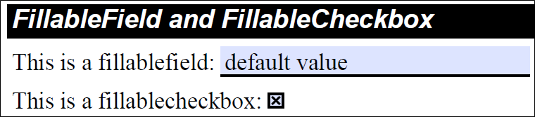
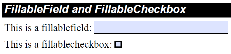
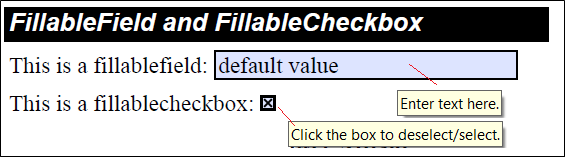
Clicking or tabbing to the Fillable Field AcroForm text field or Fillable Checkbox object gives it focus and the value may be modified/entered.